
What’s the important news in our moment of multiple crises? That the US State Department ordered its diplomats to stop using the Calibri typeface, which is a sans serif font, and replace it with Times New Roman, which has serifs.
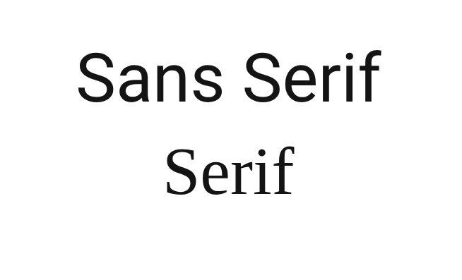
Which has whats? A serif typeface stands on flattened little feet, as if someone had come along and melted the bottom of each letter, although admittedly with some letters it’s not exactly a foot but a tail. On the other hand, a sans serif typeface doesn’t flatten out at the bottom, and unlike that doggy in the window, it has no waggily tails. It goes up and down, it goes around when necessary, and it gets off stage in as straight a line as possible.
Did I throw too many images at you in too short a space? Don’t worry about it. It’s the least of our problems.
The blog you’re looking at uses a sans serif typeface–no feet; no tails; all business. Or since one picture’s worth 839 words:
 So that’s what we’re talking about, but still, when a rich and powerful nation orders its minions to abandon one typeface and use another, sane people everywhere rise up from their Crunchy Munchy Oatsies* and ask why the country has nothing better to do with its time.
The explanation . . .
. . . or as close to an explanation as I can get, given that none of this is going to make much sense.
Once upon a time, children, a man named Joe Biden was the U.S. president and the State Department began using the Calibri typeface, because Calibri is easier for people with visual disabilities to read, and if anybody cared it didn’t make the evening news. Then the country elected a new president who I won’t bother to name because it’ll only depress me, and with him came a new secretary of state, Marco Rubio, who seized upon that business about disabilities and said**, “Ha! Wasteful diversity move. I’ll take care of that.” Because why should some bunch of disabled whiners get to make the rest of the world read their preferred typeface? We all have problems, right? If I’m allergic to onions, do I get to stop you from eating onions?
(The * above indicates an entirely made up breakfast cereal, and the ** an entirely made up quote, although I’m reasonably sure the words “wasteful diversity” come from an actual quote. They may or may not have been rubbing shoulders as they do here. Close enough.)
How much did the wasteful changeover to Calibri cost? If anyone’s offered a number, I haven’t found it.
How much did it cost to roll back that wasteful changeover? The same amount it cost to introduce it, I’d guess, but never mind. Calibri is the woke typeface and therefore bad. Times New Roman is its opposite, the non-woke typeface, and therefore good. So if the woke change was wasteful, the un-woke one must, ipso facto, QED, and several other Latin-inflected inserts, be the opposite of wasteful. Who knows, it might be so opposite it positively generates income.
But it’s not all about cost and that now-forbidden phrase, diversity, equity, and inclusion: “Consistent formatting,” the State Department pontificated, “strengthens credibility and supports a unified Department identity.”
Credible? Unified? Sweetie, you’re going to need more than a change of typeface.
A story comes to mind. It may not be relevant, but I do hope it is: many and many a year ago, someone I know worked for an organization that the State of Minnesota had just started investigating for fraud. Management was visibly coming unglued and one of the executives ended a staff meeting early so everyone could go file a mess of papers that had been left lying around. Not because she was trying to hide them–they weren’t the papers that needed hiding–but because it was one of the few things she could control at that moment.
Not that long afterward, the organization went down the tubes and the director went to jail.
Maybe, however, if they’d changed their typeface–
The creator weighs in, and so do I
The man who created Calibri, Lucas de Groot, said it “was designed to facilitate reading on modern computer screens” and that he found the uproar over it both sad and hilarious.
I find it mostly hilarious but with overtones of infuriating. I like Times New Roman and I’m not a fan of Calibri or any other sans serif font. That makes me worry about the company I’m keeping. First chance I get, I’ll have a serious talk with myself and see if I can bring my aesthetic preferences into line with my politics.
However, I have zero control over the typeface this blog uses, so don’t read anything into it and don’t expect it to change. It’s one of the many things in life I have no control over. I did ask Lord Chatbot the name of the typeface, though, and he told me it was Georgia, which goes to show you what Lord Chatbot knows. Georgia’s a serif face. This is definitively sans.
I have no control over much of anything, but I can one-up a chatbot with the best of ’em.
None of this, I admit, has any connection with the alleged topic of Notes. It interested me. It’s absurd. And I’m originally from the U.S. From where I sit, that’s a good enough excuse.

Aaargghh. Is all I can say. I use Times New Roman, but why, don’t ask. No idea this was so complicated. And silly. It just annoys me that you can’t put TNR as a default on Word and you have to scroll down each time. Couldn’t they fix that instead?
LikeLiked by 1 person
I’m sure there’s a way to set it as default, although I can’t think where it would be. Way back when, I found a way to set a default for all my documents–which version of English the spell-check would use, and probably typeface as well, although I may be hallucinating that. I couldn’t find it again to save my sanity. I change over from time to time, but mostly I can’t be bothered. So yes, sympathy.
Why make it a political-warfare issue? Because we all need an enemy, and the maniacs in charge in the US right now need multiple enemies. They’re exactly the sort of people who’d declare war on a typeface.
LikeLike
When I worked for a company producing educational software, we used a sans serif font as an aid to clarity for readers. It doesn’t hurt anyone, it helps some, and, since beauty is in the eye of the beholder, there’s no real harm aesthetically. (Though I do like Times New Roman). Authoritarian regimes love to impose their “taste” on the people: Hitler and Stalin, to name two recent examples. It’s control, distraction, naming and shaming, restriction of free choice and it’s cheap to do. Well, apart from all that delightful gilding in the White House…
Jeannie
LikeLiked by 1 person
I’m with you all the way until we hit cheap to do. Want to bet they sank a lot of money into redesigning and reprinting letterheads, websites (no reprinting needed, but still, redesign ain’t cheap), and everything else available? For the rest, though? Well said!
LikeLiked by 1 person
I don’t think that the point here is what kind of font the governmentn is forcing people to use in the U.S., it’s how Trump wants to control every single citizen living in the U.S. territory that he’s trying to control, by changing the smallest, unimportant things that people overlook first, then, he is going to, expand the changes to larger issues like how schools will force the girls to grow their hair longer (because it makes them look more feminine) the boys to get their hair cut short (because that’s how boys are supposed to look), and he’s starting with these barely noticeable changes that people wouldn’t pay attention to, and step by step, the lives of the people in the U.S. will all be controlled by him, I think, that’s, his, ultimate goal, to have EVERYBODY follow his order, where the people like it or not!
LikeLiked by 1 person
I’d estimate his intelligence to be somewhere on the level of mud (as in, he’s dumb as…), so beyond a few key issues that appeal to his emotions and a desire to, as you say, have everyone follow his orders, I doubt he’s got much of a plan. The people around him, however, do, and some of them are ruthless bastards. So yes, micromanage. Control. Push everyone back into their boxes.
Scary times indeed.
LikeLike
What a waste of time and money for some cheap point. I dont find Trump et al the least bit funny.
LikeLiked by 1 person
Sorry, if that sounds harsh but yesterday’s events in Minnesota sickened me.
LikeLiked by 1 person
Not a problem. The list of events over there that sicken me is getting longer by the day. The woman they shot in Minnesota? My partner was just reading me an article on the shooting–from the New York Times, I think. She was only there to drop her kid off at school.
LikeLiked by 1 person
Yes, deeply upsetting.
LikeLiked by 1 person
I really appreciate your willingness to be critical about what I wrote. It’s good to hear that kind of thing–always.
LikeLiked by 1 person
Understood. On the other hand, making fun of fascists can be a useful strategy. I hope.
LikeLiked by 1 person
“There’s a crazy amount of random font differences in these memos” – Ben Wyatt
LikeLiked by 1 person
Sorry, you’ve gone over my head there. Not hard to do. I’m nothing if not short.
LikeLike
Thank you for this very entertaining commentary. The world has gone mad.
LikeLike
Hasn’t it just? And I try to limit myself to the funny stuff, which shoves 119% of it out of bounds.
LikeLiked by 1 person
I love the way you make it fun to read
LikeLiked by 1 person
Thanks for that. Making fun of the mad people in power is one of the few things I can contribute from across an ocean.
LikeLiked by 1 person
They should have changed to Comic Sans! :-)
Regards, Chris.
LikeLiked by 2 people
You should’ve been a political consultant. You clearly missed your calling.
LikeLiked by 2 people
I would venture to guess that being “from” the USA, you may be happy to be watching this awful circus from across an ocean. Every time one thinks, it can’t get any worse – it does.
LikeLiked by 1 person
Happy isn’t the word I’d use. I’m grateful not to be up to my eyeballs in the insanity and at the same time frustrated that I can’t so much of anything from over here. Not that anyone seems to have come up with the right thing to do over there, but I grew up on demonstrations and I really, really wish I could be part of them just now.
LikeLike
Maybe because it’s true for me, I suspect it’s true for Rubio: Anywhere, any way you slice it, Calibri is NO treat to read. Times New Roman is much more eye-friendly. In Calibri all the I’s and l’s and i’s and f’s and t’s and even 3’s and 7’s look alike.
I *hope* it’s his eyes. For me telling employees not to use Calibri because some days I can’t read it is reasonable. Telling them to use TNR, or Georgia for that matter, because it’s somehow bad for the office if everyone has a “signature font,” is control-freaky.
LikeLiked by 1 person
Good distinction. And when I catch a glimpse of control freakery, I can’t help thinking that somewhere in the background is someone who’s so completely out of their depth that they latch onto some bit of minutiae because–eek!–it just might make them look like they’re in control of something.
LikeLike
Yes, Comic Sans is the one everyone seemed to make fun of even before all this petty #$%&. You are right in stating that the US State Dept will need more than a different type face to restore integrity.
LikeLiked by 1 person
It’s so much easier to break things, it turns out, than to fix them. I’m not sure what it’s going to take at this point.
LikeLike
Hello, Ellen. I tried to post a comment yesterday but I think it may not have got through. Anyway, memory isn’t up to a resend…
New comment: a few weeks ago we had a new router which required entering the password manually. A few attempts failed and the installer couldn’t do any better, so we eventually managed to scan and enter it, which worked. Turns out, the first letter should have been an upper case I, not a lower case L. The two can be differentiated if you look really closely, but in what universe does that make sense for a password? Fine in a word, where the brain fills in much of what we read but unless a font is for decorative use only, clarity should be the overriding criterion.
Jeannie
LikeLiked by 1 person
My eyes aren’t what they used to be, so I thought that was just me struggling to tell the difference. It’s reassuring to know it’s not, although what I really should be doing here is sympathizing and saying, “Oh, that’s terrible.” Wherever did I learn my manners?
LikeLike
Times New Roman – argl, I really can not see that any more. It was the “word” standard font for ages. In the end it’s Bodoni and Garamond, the rest is crap – says the man who uses a Sans for the text of posts (Merriweather sans – falls large, comes black on my screen, blacker than others, hence better readable – at least I hope so).
“Appearance”, “Customize”, “Fonts” – works in my settings, and every three months or so I play around, just to come back to EBGaramond for titles and MerrySans for text.
btw The nazis preferred the “Tannenberg” and other broken fonts, until 1941 when “Antiqua” became the Normalschrift.
Have I wishes a Good New Year ? If not, I do now : Happy New Year, and all.
LikeLiked by 1 person
I’m not surprised the Nazis would’ve had a preferred–ultra-Germanic, I assume–font to fit with the myth and help make it all-encompassing. You couldn’t use Comic Sans for that.
Wishing you a good new year as well, although I find myself sympathizing with the people circulating social-media requests for a gently used old year instead of an unknown new one at a time when it’s all so likely to go wrong. Still, here we are, so I’ll wish you all the best of the one we have.
LikeLike
It brings to mind rearranging the deck chairs on the Titanic. Nobody can read most of what comes out of a government office anyway. I’m a serif fan, but I don’t like it enough to use it if something else is easier to read.
LikeLiked by 1 person
Serif or no serif, I will not be helping at the pumps if the ship’s going down. And you’re right, I think, about the unreadability of what comes out of government offices. And–since I’ve been going through my inbox and deleting most of it–what’s sent by political parties, even those I’d prefer to the idiots currently in office. When you think of how much time and effort must go into writing that drivel…
LikeLiked by 1 person
What are the chances it’s AI, not humans who are writing the drivel? You only have to programme it: group A is all good, their actions noble and heroic, group B is all bad, their actions wicked and disruptive. The government is holding back the tide, so any requirement they impose is saving the nation…
Jeannie
LikeLiked by 1 person
Anything is possible, and the more improbable the more likely it is. (You know The Hitchhiker’s Guide to the Galaxy–the infinite improbability drive? If we had one, think of the power it would’ve stored up by now.) So much as I’d like to argue with you…
LikeLike
Our goal over here now is the pretend that anything that happened in the last half-century or so didn’t happen.
LikeLiked by 1 person
And that if it did, it didn’t happen that way. Or was the result of evil forces trying to destroy our Amurrican [for which you can read white, straight, etc] way of life. Or have I been out of the country too long and am misidentifying the enemy and the bullshit?
LikeLike
Nope. The bullshit is the same.
LikeLiked by 1 person
Gee, it’s nice to know a person can count on certain things.
LikeLike
Abandon all reason, you who enter here.
LikeLiked by 1 person
Tell me about it.
LikeLiked by 1 person
As a Certified Technical Writer complete with papers and a self-described “Word Nerd” upon my many Nerdships (Look I just invented a new word!) I’m quite sure that all the birds in the neighborhood were startled when I suddenly yelled, “Is nothing sacred?” As an American feeling attacked on all fronts by my own government I cannot believe they even had the time of day to go after our very font preferences!
I should like to revert to Old Bookman Style in retaliation, but it would only bedevil my own poor eyesight and that of the people I actually like. However, I will continue to make myself terribly inconvenient at every possible opportunity to those who think themselves our kings. Hmfp!
LikeLiked by 1 person
If I could send you a batch of brownies for that comment, I would. All possible credit–and virtual brownies–to the Americans who make themselves inconvenient, although I suspect there are more useful ways than bringing back Old Bookman.
On the other hand, we do have to keep ourselves amused while we do the harder stuff….
LikeLiked by 1 person