
What’s the important news in our moment of multiple crises? That the US State Department ordered its diplomats to stop using the Calibri typeface, which is a sans serif font, and replace it with Times New Roman, which has serifs.
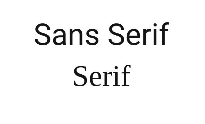
Which has whats? A serif typeface stands on flattened little feet, as if someone had come along and melted the bottom of each letter, although admittedly with some letters it’s not exactly a foot but a tail. On the other hand, a sans serif typeface doesn’t flatten out at the bottom, and unlike that doggy in the window, it has no waggily tails. It goes up and down, it goes around when necessary, and it gets off stage in as straight a line as possible.
Did I throw too many images at you in too short a space? Don’t worry about it. It’s the least of our problems.
The blog you’re looking at uses a sans serif typeface–no feet; no tails; all business. Or since one picture’s worth 839 words:
 So that’s what we’re talking about, but still, when a rich and powerful nation orders its minions to abandon one typeface and use another, sane people everywhere rise up from their Crunchy Munchy Oatsies* and ask why the country has nothing better to do with its time.
The explanation . . .
. . . or as close to an explanation as I can get, given that none of this is going to make much sense.
Once upon a time, children, a man named Joe Biden was the U.S. president and the State Department began using the Calibri typeface, because Calibri is easier for people with visual disabilities to read, and if anybody cared it didn’t make the evening news. Then the country elected a new president who I won’t bother to name because it’ll only depress me, and with him came a new secretary of state, Marco Rubio, who seized upon that business about disabilities and said**, “Ha! Wasteful diversity move. I’ll take care of that.” Because why should some bunch of disabled whiners get to make the rest of the world read their preferred typeface? We all have problems, right? If I’m allergic to onions, do I get to stop you from eating onions?
(The * above indicates an entirely made up breakfast cereal, and the ** an entirely made up quote, although I’m reasonably sure the words “wasteful diversity” come from an actual quote. They may or may not have been rubbing shoulders as they do here. Close enough.)
How much did the wasteful changeover to Calibri cost? If anyone’s offered a number, I haven’t found it.
How much did it cost to roll back that wasteful changeover? The same amount it cost to introduce it, I’d guess, but never mind. Calibri is the woke typeface and therefore bad. Times New Roman is its opposite, the non-woke typeface, and therefore good. So if the woke change was wasteful, the un-woke one must, ipso facto, QED, and several other Latin-inflected inserts, be the opposite of wasteful. Who knows, it might be so opposite it positively generates income.
But it’s not all about cost and that now-forbidden phrase, diversity, equity, and inclusion: “Consistent formatting,” the State Department pontificated, “strengthens credibility and supports a unified Department identity.”
Credible? Unified? Sweetie, you’re going to need more than a change of typeface.
A story comes to mind. It may not be relevant, but I do hope it is: many and many a year ago, someone I know worked for an organization that the State of Minnesota had just started investigating for fraud. Management was visibly coming unglued and one of the executives ended a staff meeting early so everyone could go file a mess of papers that had been left lying around. Not because she was trying to hide them–they weren’t the papers that needed hiding–but because it was one of the few things she could control at that moment.
Not that long afterward, the organization went down the tubes and the director went to jail.
Maybe, however, if they’d changed their typeface–
The creator weighs in, and so do I
The man who created Calibri, Lucas de Groot, said it “was designed to facilitate reading on modern computer screens” and that he found the uproar over it both sad and hilarious.
I find it mostly hilarious but with overtones of infuriating. I like Times New Roman and I’m not a fan of Calibri or any other sans serif font. That makes me worry about the company I’m keeping. First chance I get, I’ll have a serious talk with myself and see if I can bring my aesthetic preferences into line with my politics.
However, I have zero control over the typeface this blog uses, so don’t read anything into it and don’t expect it to change. It’s one of the many things in life I have no control over. I did ask Lord Chatbot the name of the typeface, though, and he told me it was Georgia, which goes to show you what Lord Chatbot knows. Georgia’s a serif face. This is definitively sans.
I have no control over much of anything, but I can one-up a chatbot with the best of ’em.
None of this, I admit, has any connection with the alleged topic of Notes. It interested me. It’s absurd. And I’m originally from the U.S. From where I sit, that’s a good enough excuse.
